Showing posts with label NHL. Show all posts

Monday, July 2, 2007

Somebody Give Pat Gillick the Name of Daniel Briere's Agent

Sure, the Flyers recently signed free agent center Daniel Briere to a nice $52 million contract, but it's clear that the players of the National Hockey League lack the consul of "superagent" types. Whereas agents in other leagues find that it's easy to hoodwink teams into believing that an athlete is worth more as he gets further from 29 years old, the puckheads are letting things like this slide:

The contract is heavily front-loaded, with Briere to make $10 million next season -- double what he made last year. He'll then make $8 million in the next two years and $7 million during the 2010-13 seasons. The contract then tapers off with Briere scheduled to make $3 million in 2013-14 and $2 million in the final year of the deal.


You know that wouldn't fly if Boras or Rosenhaus had their fingers in this cookie jar. They could probably negotiate a 3-year, $35 million deal for Gordie Howe, citing Moses as a precedent for his expected physical stamina and "leadership ability," and nobody would bat an eyelid. The stiffs at the NHL's business offices need to know how lucky they are to not have these types of guys around.

On the other hand, the NHL's main employees--the players--are not so lucky. This incredibly logical way of placing the correct value on the diminishing athletic abilities of aging players is not accepted with such sangfroid in any other major professional sports league. Then again, the players' union in any other MPSL (I like time-saving acronyms) isn't even close to the unprecedented level of weakness of the NHL's. After the 2004-05 lockout--which I recall as a few vague memories of weeping Canadians--players returned to face the bitter reality that an entire season of hockey was canceled and few people cared. Goodbye leverage. Hello peanuts.

Even though I think the NHL's product has improved by leaps and bounds since then, I'm not yet disheartened by this shift in the balance of power. You have to figure the owners aren't making a hell of a lot of money either, not when your team's "national exposure" is roughly once a month on a channel anchored by televised rodeos and karate competitions. Too bad the players don't have quite as much to fall back on anymore.

But hey--if P. Diddy and the Phillies starting rotation have taught us anything, it's that mo money equates to mo problems. Enjoy this period of fiscal sanity while it lasts, hockey fans.

Sunday, May 6, 2007

This Is Not How You Pursue the Urban Demographic


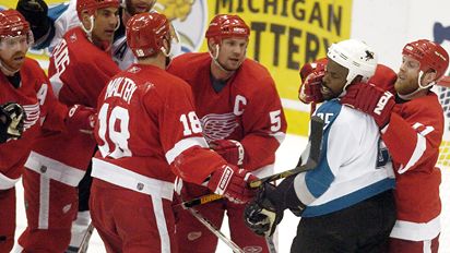
And this after all the progress made from Lil Jon's playoff blog and Snoop Dogg's interview. If enough of these photographs are taken out of context, the NHL can say goodbye to its core "millionaire rappers with hockey-playing children" audience.

Monday, April 9, 2007

Unreasonable Doubt: NHL Playoffs 2007

In this increasingly unstable world, it's nice to know you can count a few things once mid-April rolls around: the first robin of spring, the Phillies digging themselves a hole to China in the NL East, and the Stanley Cup playoffs.

Regular season hockey is hard for me to watch, even when I can manage to find it stranded on some godforsaken strip of the basic cable wasteland. These issues were only exacerbated by the fact that the Philadelphia Flyers had their worst season since, well, ever.

But I generally don't follow the NHL until the playoffs start anyway, as is customary for non-puckheads who prefer crazy triple-overtime thrillers to fretting over Shane Doan's plus-minus or whether the Blue Jackets' use of the trap strengthens their penalty kill. I watch it mostly for all the movement and pretty colors. That glowing puck was really purty back in the day.

Therefore, I shall preview each upcoming first-round series by examining the relative merits of each team's logo, as I know next to nothing about hockey except that it is home to some of the more garish designs in professional sports:

Buffalo Sabres v. New York Islanders


The "Buffaslug" is the new powerhouse of sports logos, mixing a classic color scheme with born-in-a-focus-group "edginess." It looks like the phlegm kids cough up when they swallow too much pool water. And who isn't intimidated by that? The Isles don't stand a chance, even if they change their logo back to the Gorton's Fisherman. Sabres in four.

New Jersey Devils v. Tampa Bay Lightning


The Devils have a lot of mojo since they've cornered the market on Satanic imagery in pro sports, even if their GM changes coaches more often than Spinal Tap changes drummers. And Tampa unwisely combines two of my pet peeves: a non-plural nickname and a graphical scheme reminiscent of a 1980s anti-drug PSA. Devils in six.

Atlanta Thrashers v. New York Rangers


What the hell is that? The Thrashers, always at the vanguard of the butt-ugly, will remind more people of a Harry Potter book cover than a competent hockey team. Who cares if the Rangers are a bit utilitarian? Rangers in seven.

Ottawa Senators v. Pittsburgh Penguins


You know, the capital of a democratic welfare state still beholden to the Queen of England easily conjures up memories of Marc Antony and Augustus Caesar. Consider the Penguins flightless barbarians, who shall smite the mighty Canadian Empire even though their marketing department has inadvertently turned the logo into a gay pride symbol. Penguins in six.

Detroit Red Wings v. Calgary Flames


A flying tire is dumb. A flaming letter "C" is just plain unimaginative. Red Wings in five.

Anaheim Ducks v. Minnesota Wild


Ok, this is getting ridiculous. Let's start with Anaheim: I can't tell if that's a capital "D" or a spaceship. Plus they dropped the "Mighty." They are flirting with some serious bad karma right there. Then there's Minnesota. It's like a paper towel landscape on acid, and far too reminiscent of another logo seemingly concocted after a lengthy Indian-style vision quest. Ducks in six (five if they use the Knucklepuck).

Vancouver Canucks v. Dallas Stars


I've always wondered what an angry whale bursting out of a blue cocoon had to do with Canadian nationalism. To be fair, though, it's hard to represent people that look just like Americans but talk with a funny accent in a graphical sense. Kudos to Dallas for keeping it simple and reminding me of Ed McMahon-hosted talent shows. Stars in seven.

Nashville Predators v. San Jose Sharks


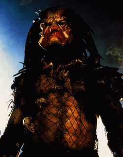
Forget the fact that Nashville's logo looks like a Transformers Beast Wars reject: there is only one Predator, and it looks like this. I like San Jose's logo a lot better based purely on the assumption that the design was stolen from the cover of a third-grader's notebook. Chomp on that stick! Sharks in seven.

And if it matters, I'll take the Sabres over the Ducks in six games for the Cup.